skip to main |
skip to sidebar
 Let cool before serving. I miss those old Hi-Fi colors.
and a Mighty Mini
A new reader of the blog who goes by Mingal sent an email and included some photos.Chris....feel free to post it... the guy I bought the photo from , said that the owner of the body work had brought it around to the local H-D shop and they displayed it for a week, trying to get some sales for it. The captain is ready for blast off!I've seen similar pictures that describe it as an "Enterprise" and I think it was from 1961. Just thought you might get a giggle out it for your blog, which I might ad, is very well done.Here's another cool photo, taken of me on a 1969 Honda Mini-Trail with a mid 60's 650 Triumph engine in it. Starts on the first kick, makes a lot of noise and grabs a lot of attention.......yeah, it's "only" a single carb. :)
 I'm surprised how well the engine fits. In addition to the down tubes and lower frame rails, I'd guess the backbone is also stretched some. -C.K.
Had to put these up for Rich after finding he's an out of the closet Liberator fan. Go to his Applied Machete blog for more info on these little seen beasts. This shot was taken at Graceland. I believe it's a '76. Yup, that's a Stutz. The King had impeccable taste.
  I believe it's now on display at a Harley dealer.
A behind the scenes look at how I do a painting
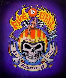
The following article will be featured on Bikernet.com but I wanted to give my loyal blog readers the first look at it. Also, remember to click on the images for a better view. Large image views will only be possible on this blog version of the story.I've always been interested in how other artists work or achieve certain effects and I've read a few step-by-step articles by artists documenting their processes. With that in mind, I thought it might be interesting to document, and share, how I went about painting this project.The project started on fairly short notice. Keith Ball asked me if I was interested in displaying some art at Michael Litcher's Stay Gold tribute to Johnny Chop in Sturgis last year. I had a couple of finished paintings on hand, but Keith hoped I'd do something new that would complement the Salt Shaker which was included in the show. Since time was short and I needed to frame the other two paintings, doing a painting of the Salt Shaker would be pushing it. I needed to do something a bit simpler and decided to paint a version of the 5 Ball Racing logo. I wanted to paint a color version of that logo since designing it, and It would also show a slightly different side of my work. The painting would be based on this t-shirt/decal design.A few things to keep in mind before we start - I don't necessarily work exactly the same way on every project. It's hard to stop and shoot each and every step. Some of the colors of the art may not look exactly the same since the photos were shot over a period of time and the lighting conditions or camera settings varied.
 Before painting, a color study of the art was done in Photoshop to work out the color palette. Keith used it to advertise Thursdays News.
 Here's the paints I use. They are water based acrylic paints that were developed for cell animation. The pros: They are more opaque (similar to Gouache), than traditional artist acrylics, yet permanent, bright, won't fade, and come in convenient squeeze bottles. The cons: They dry so fast they need to be constantly rewetted on the palette, can be difficult to airbrush, and don't flow as well as oil based paints or lettering enamels.
 From this mess, somehow a painting will emerge.
 1. For several years, I've been gluing drawings (or copies of them), on illustration board and fiberboard panels. That way, I don't have to spend the time carbon transferring or redrawing the art on the final surface. I found a cool frame in my stash, so the painting's size was determined by the frame. After printing out the art from my computer, I made a bunch of different sized Xerox copies to see which would best fit the frame. When making copies, I make sure there's plenty of extra paper around the design to trim later. Crop marks are included on the image as a rough sizing guide and to keep the design straight for final trimming.2. Next, I cut a slightly oversized piece of 1/8" fiberboard. The reason - it's very difficult to paste the design exactly where you want it.
 3. Working fast and starting at the top, I begin by brushing the top 1/3 section of the board with a generous amount of acrylic medium. Because it dries and soaks up fast, I only lay down the top 1/3 of the drawing, while holding the rest of it up, and roll down that portion before painting more medium. I quickly brush down more medium and roll the next portion down, and repeat until it's all down. Then, I quickly roll out the whole surface with increased pressure making sure to press out the excess medium and any air pockets. If there are any stubborn air pockets or wrinkles, I cut a slit in them and roll or brush them down with more medium.
 4. After it's dry, I cut the board to the desired size by repeatedly scoring a line with an x-acto knife until it cuts completely through the board. The rough edges are then cleaned up with sandpaper. You can see that the crop marks on the right actually ended up being inside the trim size. 5. Next I paint the entire surface with more acrylic medium which gives the surface a brush stroke texture (tooth).
 6. I then paint over the whole image with Gesso, just thick enough to give it a good working surface but letting the image show through. The gesso acts as a primer which helps the top coats of paint adhere to the acrylic medium. It also creates a bright undersurface that brightens the lighter colors like yellow.
 7. Under painting. I start putting down paint without too much care about any one thing. The idea is to just start covering as much of the white surface as possible so that you can build upon that and make choices in regards to color and shade. I started with the yellow areas first since yellow is light and tends to be a bit transparent. It can later be easily painted over with orange and out lined later with black. Notice how you can still see the words Bikernet.com through the yellow paint. I also started some basic mottling and shading of the skull and bones. The black outlines were painted in places so I don't loose the image as I paint. I don't worry too much about how crisp or perfect the lines are as I can then work within those areas and always go back and touch up the outlines later.
 8. More under painting. Since it gets kind of boring, I tend to hop around a bit. The background color is built up by painting over it again. More skull and bone mottling was added and I have blocked in the colors of the torch. I also experimented more on how the lighter areas of the blue outline glow will look.
 9. At this point, the woman, checkered flags, and the grinder are about 90% done. Later I'll come back and retouch most everything - things like enhance the shading, add highlights, tighten up outlines, etc. Also, at about this stage, I found my deadline was moved up several days earlier than originally planned. Keith now told me, he had to drive everything up to Northern California the following day so, it could make it on a truck that was headed for Sturgis.
 10. Detail of the woman. For Keith a pin up is mandatory for Bikernet art
  11. Detail of the grinder area. You can also see how the black outlines of the tips of the banner will need to be touched up.
 12. The lettering is now complete and the torch has been highlighted and finished. The skull, bones, and the blue and black outlines still need some work.
 13. Most everything has been re-outlined or touched up. The skull and bones are more refined, the helmet's seam received a highlight, and the number 5 and a highlight were added to the ball as well. Keith reminded me I had until midnight since he was leaving early the next morning. So, like it or not, I stopped and considered it done. I stuck it in the frame, boxed it up, and got to Keith's place about 10:45 p.m.
 14. Here's how it looked framed for the show.
 15. After the art returned from Sturgis, I thought it looked a bit flat in places. To improve it, shading was added under the woman and around the edges of the helmet. A large primary highlight (by the B in Bikernet), and several smaller secondary highlights were added as well. To give it more form, the helmet's seam is now shaded and more highlights were added. Note, the pinstripes on the helmet's scallops are still in progress and not complete on it's right side. Shading and more highlights were added to the 5 ball, the woman has been retouched, and some re-working of the blue glowing out lines is in process as well.
 16. To better match the color study and for added drama, the outer edges of the panel were airbrushed with black. This was the only airbrushing done.
 17. Finally, to protect the art, the entire image was clear coated with Krylon Satin Acrylic spray. It uniforms the sheen of surface and enhances the contrast. It's a little scary, since it does affect the warmth and contrast of the colors. If you don't like the way something now looks, it makes any further retouching very difficult, as you now would have to guess how the colors will look when it's re-cleared. Compare this image with the one in step 13.
 18. The finished art now framed once again.
....of My Favorite Things His n' Hers
 I've put my bike on a diet. Next to go will be the spotlights and rear crash bars.
In case you missed it on Stretch's blog, here's more of Dick's dirt bike. Sort of a English Harley. You could build something quite similar starting with a '79 and up Ironhead.
 The Dutch's Touches. The specs. of the bike are mention in the post below comments.
My good friend Larry Settle has this nice Panhead up For Sale SOLD This bike was originally featured in the June '87 issue of Supercycle magazine. The original article is posted below. It had only been on the road for 3 years and then sat since 1990. It's been gone through and made road worthy once again.
 Some of the original parts wandered off. It shouldn't be a surprise that a few changes have been made since it was featured more than 20 years ago.
 The engine was made fresh again by JR. He built it the first time, and it now features new STD outside oiler heads with the stock type exhaust ports, an S&S Shorty "E" to take in the mixture, Mallory ignition for reliable spark, and a new Cycle Electric 12 volt generator for reliability as well.
 The frame is a wishbone and in very good shape. The neck and tank mounts have never been messed with. The tanks are now genuine later style H-D 3.5 gallons. The fork appears to have an original H-D dampener.
 Side car mounts are still in tact. jockey shift/foot clutch is the current set up and a new belt drive system is lurking behind a new primary cover. The engine is Blue tagged but, the bike is titled in CA as a 1953 Harley-Davidson.
 The bike is a classic and retains the original mechanical brakes. That's a big plus to me. The paint on the tanks and fender is new. The original pillion pad (see article below), is also included if you want it.
 Do what the plate says! Price $12,000 firm.
I've known Larry for 30 years and have bought three bikes and my 45 engine and trans from him. Too bad I can't buy this one. His shop is in Harbor City near California Harley. He does all the stuff they can't handle and that goes for me as well. Give him a call at (310) 326-3466 or email lsettle1948@sbcglobal.netDon't forget to tell him Chris from MC art sent ya!Here's the June 87 Supercycle spread When the subject of show or magazine feature bikes comes up, I always wonder, where are they now? We now know the answer on this one.
 90% of he bike is the same. If you wanted to, it wouldn't take much to put it back to this look..
 Fat tank tight chops were very popular in the 80's. This classic style was a favorite in Supercycle.